
Honoco branding
Deprecated: Constant E_STRICT is deprecated in /home/jaja8595/public_html/includes/errors.inc on line 29
Deprecated: Constant E_STRICT is deprecated in /home/jaja8595/public_html/includes/errors.inc on line 29

Honoco
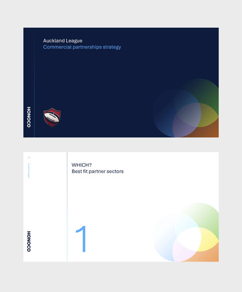
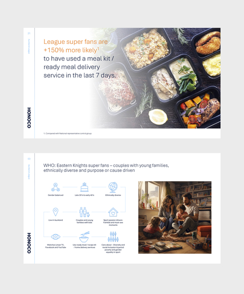
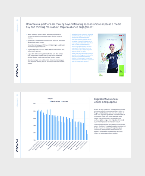
JND were asked to create a brand for strategic partnership specialists Honoco. They deliver strategy, insights and measurement that initiate best-practice partnerships. The logo references the te reo Māori meaning of Hono which means to join, connect or link and was inspired by the symbolism of intertwined rings.
This symbol formed the basis for a visual style that was expanded across all design platforms including print and digital materials.
See the website.
What we did:
- – Logo
- – Digital documents
- – Print materials
- – Website
- – Styleguide
Deprecated: Constant E_STRICT is deprecated in /home/jaja8595/public_html/includes/errors.inc on line 29
Deprecated: Constant E_STRICT is deprecated in /home/jaja8595/public_html/includes/errors.inc on line 29
Deprecated: Constant E_STRICT is deprecated in /home/jaja8595/public_html/includes/errors.inc on line 29
Deprecated: Constant E_STRICT is deprecated in /home/jaja8595/public_html/includes/errors.inc on line 29

Deprecated: Constant E_STRICT is deprecated in /home/jaja8595/public_html/includes/errors.inc on line 29
Deprecated: Constant E_STRICT is deprecated in /home/jaja8595/public_html/includes/errors.inc on line 29
Deprecated: Constant E_STRICT is deprecated in /home/jaja8595/public_html/includes/errors.inc on line 29
Deprecated: Constant E_STRICT is deprecated in /home/jaja8595/public_html/includes/errors.inc on line 29

Deprecated: Constant E_STRICT is deprecated in /home/jaja8595/public_html/includes/errors.inc on line 29
Deprecated: Constant E_STRICT is deprecated in /home/jaja8595/public_html/includes/errors.inc on line 29
Deprecated: Constant E_STRICT is deprecated in /home/jaja8595/public_html/includes/errors.inc on line 29
Deprecated: Constant E_STRICT is deprecated in /home/jaja8595/public_html/includes/errors.inc on line 29

Deprecated: Constant E_STRICT is deprecated in /home/jaja8595/public_html/includes/errors.inc on line 29
Deprecated: Constant E_STRICT is deprecated in /home/jaja8595/public_html/includes/errors.inc on line 29
Deprecated: Constant E_STRICT is deprecated in /home/jaja8595/public_html/includes/errors.inc on line 29
Deprecated: Constant E_STRICT is deprecated in /home/jaja8595/public_html/includes/errors.inc on line 29

Deprecated: Constant E_STRICT is deprecated in /home/jaja8595/public_html/includes/errors.inc on line 29
Deprecated: Constant E_STRICT is deprecated in /home/jaja8595/public_html/includes/errors.inc on line 29
Deprecated: Constant E_STRICT is deprecated in /home/jaja8595/public_html/includes/errors.inc on line 29
Deprecated: Constant E_STRICT is deprecated in /home/jaja8595/public_html/includes/errors.inc on line 29

Deprecated: Constant E_STRICT is deprecated in /home/jaja8595/public_html/includes/errors.inc on line 29
Deprecated: Constant E_STRICT is deprecated in /home/jaja8595/public_html/includes/errors.inc on line 29
Deprecated: Constant E_STRICT is deprecated in /home/jaja8595/public_html/includes/errors.inc on line 29
Deprecated: Constant E_STRICT is deprecated in /home/jaja8595/public_html/includes/errors.inc on line 29

Deprecated: Constant E_STRICT is deprecated in /home/jaja8595/public_html/includes/errors.inc on line 29
Deprecated: Constant E_STRICT is deprecated in /home/jaja8595/public_html/includes/errors.inc on line 29
Deprecated: Constant E_STRICT is deprecated in /home/jaja8595/public_html/includes/errors.inc on line 29
Deprecated: Constant E_STRICT is deprecated in /home/jaja8595/public_html/includes/errors.inc on line 29

Deprecated: Constant E_STRICT is deprecated in /home/jaja8595/public_html/includes/errors.inc on line 29
Deprecated: Constant E_STRICT is deprecated in /home/jaja8595/public_html/includes/errors.inc on line 29
Deprecated: Constant E_STRICT is deprecated in /home/jaja8595/public_html/includes/errors.inc on line 29
Deprecated: Constant E_STRICT is deprecated in /home/jaja8595/public_html/includes/errors.inc on line 29
Deprecated: Constant E_STRICT is deprecated in /home/jaja8595/public_html/includes/errors.inc on line 29
Deprecated: Constant E_STRICT is deprecated in /home/jaja8595/public_html/includes/errors.inc on line 29
Deprecated: Constant E_STRICT is deprecated in /home/jaja8595/public_html/includes/errors.inc on line 29
Deprecated: Constant E_STRICT is deprecated in /home/jaja8595/public_html/includes/errors.inc on line 29

Deprecated: Constant E_STRICT is deprecated in /home/jaja8595/public_html/includes/errors.inc on line 29
Deprecated: Constant E_STRICT is deprecated in /home/jaja8595/public_html/includes/errors.inc on line 29
Deprecated: Constant E_STRICT is deprecated in /home/jaja8595/public_html/includes/errors.inc on line 29
Deprecated: Constant E_STRICT is deprecated in /home/jaja8595/public_html/includes/errors.inc on line 29
Deprecated: Constant E_STRICT is deprecated in /home/jaja8595/public_html/includes/errors.inc on line 29
Deprecated: Constant E_STRICT is deprecated in /home/jaja8595/public_html/includes/errors.inc on line 29
Deprecated: Constant E_STRICT is deprecated in /home/jaja8595/public_html/includes/errors.inc on line 29
Deprecated: Constant E_STRICT is deprecated in /home/jaja8595/public_html/includes/errors.inc on line 29
Who knew branding could be so much fun!
This is the second company branding project I’ve undertaken with James. From the initial brief, concepts, colours and fonts the process was truly collaborative and fun. James has a real skill for extracting the brief from you and understanding exactly what the business is about. His creativity and enthusiasm for the process of building a brand was infectious and it was a delight for our team to be involved along the way, then see it all come together in a professional, considered and tailored way.
If you have a brand story to tell, I couldn’t recommend James more.

